DELIVERABLES
Research
User Flows
UI Visuals
Prototype
DSM Library
ROLE
Senior UX Designer
YEAR
2025
PROGRAMS
PROJECT OVERVIEW
PROBLEM STATEMENT
Prior to this feature, abodoo's platform lacked a centralized way to visualize and analyze skills data in real-time. Potential clients, including universities, employers, and government bodies, faced challenges in identifying skills gaps, aligning education with industry needs, and making data-driven decisions. The project's challenge was to build a brand-new skills mapping dashboard from scratch, incorporating tailored charts and visualizations to empower diverse users in bridging skills gaps, exploring career pathways, and optimizing workforce strategies.
ROLES & RESPONSIBILITIES
As the lead designer on the abodoo Skills Mapping project, my role was integral to defining and solving key user experience challenges. In addition to creating high-fidelity prototypes and detailed design documents for the development team, I was responsible for presenting these solutions to stakeholders. Collaborating closely with the Project Manager, I ensured our design strategies aligned with business objectives, while my occasional direct interactions with developers helped navigate the intricate balance between design aesthetics and functional requirements.
DURATION & HANDOFF
The project spanned about 4 weeks, starting with a high-paced design week workshop. Utilising Figma, I updated the entire company through Slack and Atlassain. The Figma art boards, served as comprehensive walk through explaining reasons behind the designs.
SCOPE & CONSTRAINTS
In this project, my focus extended beyond crafting intuitive dashboards; it involved guiding users through skills insights with a supportive approach. These dashboards were more than data displays, offering real-time charts, gap analyses, trend comparisons, and AI-driven recommendations, all while considering the user experience. A notable design constraint was packaging services into sustainable tiers to maximize user value without overextending resources, avoiding features that could lead to high costs for abodoo. This careful choice in visual language was part of our strategy to make the skills mapping process less daunting and more user-friendly, ensuring a seamless journey for users from data exploration to actionable insights.
RESEARCH
In the research phase of the abodoo Skills Mapping project, we adopted a thorough and multifaceted approach to deeply understand the challenges and establish clear objectives, drawing from diverse sources to inform our design strategy. I delved into a wide array of digital dashboards, focusing on those handling high-volume data for skills analytics, such as visualizations for skill alignments, gap analyses, and interactive filters that would best serve users like learners, professionals, industry stakeholders, and academic staff. Unfortunately, direct competitors with identical products were scarce, so I pivoted to similar platforms in talent mapping, job matching, and data-driven dashboards to glean relevant insights.
To pinpoint the most effective graph types, I arranged targeted meetings with the CEO, leveraging their extensive experience in recruitment to determine visualizations like interactive charts, trend graphs, and real-time filters that would best serve our users. Once the graph requirements were clarified I compiled a comprehensive library of graph types and styles, enabling rapid selection and customization to represent complex data sets efficiently.
Using resources such as Behance, Dribbble, and similar dashboard designs from sectors like education and recruitment, I assembled an artboard with inspiration and conceptual ideas. This collection proved vital during our brainstorming sessions, where ideas were refined and evolved into actionable design strategies, ensuring the dashboard aligned with broader goals of bridging education-industry gaps and promoting user-centric interfaces.
UNDERSTAND
At the beginning of the project, the issues we faced appeared straightforward, yet the complexity of user-specific skills mapping soon became apparent. Each user had their own unique goals meaning that the dashboard process had to handle all types of requirements. This presented a unique challenge, as abodoo had no existing features similar to what we were developing, leaving us without a baseline of analytical data. I relied on insights gained from my experience and the CEO’s experience to finish off the project.
Collaboration with the project manager, data team and developers was key in tackling these challenges. Through daily stand-up meetings, we continuously evaluated our progress and adapted to new challenges. These sessions were critical for deep-diving into the nuances of each graph, understanding how our feature would enhance user experience, address specific issues, and implement the best graphs for the best value. Over time, we observed an expanding project scope, particularly with users in education and government, who required a distinct mapping pathway.
Our primary objective evolved into researching graphs that already exist and how to integrate into the platform with our data, but also scalable, allowing for the integration our potential clients’ data. We understood what visual graphs are users would want but we didn’t know what existed.
1. What’s the problem you are trying to solve?
The problem we aimed to solve was enhancing the user experience for skills analysis on abodoo, which lacked real-time visualization.
2. Who are the users and what are their goals?
The users are abodoo platform's diverse clientele, including educators, government officials, employers, and policy makers, with goals of bridging skills gaps and aligning with market needs facilitated through a streamlined, intuitive dashboard process.
3. How will they benefit from this feature?
Users will benefit from a more intuitive, dashboard showing their data in real time, to find skill gaps quicker, predict market demands and take other actionable insights.
4. What will the target persona be doing when they encounter this feature?
Upon encountering this feature, the target persona, typically an educator or recruiter, will navigate through a tailored dashboard process that aligns with their specific role and requirements.
5. What threshold of quality do we need in order for customers to experience core product benefits?
The quality threshold required is a user-friendly, intuitive interface with reliable functionality, ensuring a seamless mapping process that enhances user satisfaction and trust in the platform.
6. What assumptions are we making?
We are assuming that users will be able to find valuable insights using the charts.
01.
What's the problem you're trying to solve?
Share your feature information here to attract new clients. Provide a brief summary to help visitors understand the context and background.
02.
Feature title
Share your feature information here to attract new clients. Provide a brief summary to help visitors understand the context and background.
03.
Feature title
Share your feature information here to attract new clients. Provide a brief summary to help visitors understand the context and background.
04.
Feature title
Share your feature information here to attract new clients. Provide a brief summary to help visitors understand the context and background.
05.
Feature title
Share your feature information here to attract new clients. Provide a brief summary to help visitors understand the context and background.
06.
Feature title
Share your feature information here to attract new clients. Provide a brief summary to help visitors understand the context and background.
COMPETITOR ANALYSIS
Considering that the market does not have this feature, there wasn’t much competitor analysis to be done. We were mostly getting our information on how to proceed through the CEO or potential clients. I explored various digital platforms like talent analytics tools, education platforms, and workforce dashboards to see and understand what type of graphs or information they portray. I gathered valuable insights and shared with the team for feedback until we found the right visual graphs. By synthesising these insights, I conceptualised several dashboard wireframes and designed how each graph would work.
PAINPOINTS
In tackling the Skills Mapping project, I faced the challenge of limited information about the specific graphs our clients preferred and how to optimize the map chart as a powerful tool within a compact card format. To navigate this part of the design phase, I pivoted my research towards diverse platforms featuring interactive maps and data visualizations, examining their user experiences to draw parallels. These platforms, while not direct competitors, provided valuable insights into friendly user interface designs that emphasized intuitiveness and efficiency.
Although these platforms catered to different user stories, their UI/UX designs offered versatile approaches beneficial to our context which was the map. This strategic shift in research was crucial in developing a mapping process tailored to abodoo's needs, aligning with our clients needs. It allowed me to identify essential features—like warning indicators, quick access to job openings and adaptable legend.
EFFORT VS IMPACT
The use of an effort vs impact matrix was deemed unnecessary as the project's scope was clearly defined with all outlined features essential for implementation. This streamlined approach allowed us to efficiently convert these critical features into user stories, facilitating a rapid transition from concept into creating high-fidelity mockups. This method ensured that each feature was directly aligned with user needs, supporting our goal to enhance the user experience without the need for prioritisation typically aided by an effort vs impact analysis.
ROADMAP
We initially focused on deploying an MVP that promptly met user's fundamental needs, the map. This phase was crucial for early implementation and gathering user feedback. As we progressed, our strategy included not only enhancing the user interface, such as potentially introducing a side panel for a more comprehensive filtering tool, but also ensuring scalability. This consideration was pivotal in allowing the system to adapt and evolve, accommodating each client’s data and expanding functionalities without compromising performance or user experience.
IDEATION & DESIGN
During the ideation phase of our project, I crafted wireframes to show the flow of how a user would use the map that we identified in our initial research. The map had to indicate to the user that there was a shortage of candidates to cover certain internal roles or external roles. This map also had to allow the user to be able to find the job opening, edit it or view candidates. The map had to filter out not only job openings but skill gaps. There were so many moving pieces and it all had to fit within a single card the height of the browser viewport. This map required a lot more research, wireframing to get the user experience just right.
We validated these user flows with the Project Manager and CEO, advancing to the development of detailed high-fidelity graphs. After multiple iterations and stakeholder feedback, we finalised a design strategy. There were more research to be done as there were still known unknowns. We needed to stay flexible as the strategy could shift. I proceed to create how might we questions and user stories to further define pain points.
HOW MIGHT WE
"How Might We" statements were crafted to stimulate creative thinking and problem-solving.
How might we effectively communicate the status of each mapping step (like ‘skills gap identified', or ‘low or no jo coverage in’ a area) to enhance user clarity and reduce confusion on a dashboard?
How might we design the mapping process to be intuitive and user-friendly?
How might we ensure that users are aware of the dependencies between different mapping steps and understand the sequence in which they need to be completed?
How might we implement their data into this new platform?
• • How might we provide the right graphs to identify other demands in the market?
USER STORIES
I developed user stories closely aligned with our users' experiences. These stories guided our design, ensuring that each feature addressed real user needs and real statuses of the mapping requirements. This approach helped us empathise with our users, leading to a mapping process that was intuitive, user-centric, and highly effective in meeting their specific requirements.
User story 1
As a user, I want to access real-time visualizations of supply of either skills or jobs vs demand on the map so that I can quickly identify low coverage supply, up skilling potentials and align faster with market needs.
User story 2
As a user, I want interactive filters for data by skills, jobs, internal workforce, talent pipeline, job openings, matching candidates and search for specific job positions so that I can tailor analyses to specific contexts and uncover targeted insights efficiently.
User story 3
As a user, I want to view top skills of your students, analyze course performance, and registered students so that I can plan personalized upskilling journeys that support long-term sustainability goals.
User story 4
As a user, I want seamless integrate my data, so that I can rely on up-to-date information for accurate gap analyses without manual effort.
User story 5
As a user, I want the system to notify me when there is a low coverage area or there is a potential to up skill certain workforces.
HI-FI DESIGNS
Once I received sign-off from the team on the map's UX, I built a library of graphs adhering to our updated design style. This library enabled me to rapidly prototype various graph styles while maintaining consistency across the dashboard. It proved invaluable in saving time during multiple iterations, as we experimented with combinations to determine the optimal setup. We retained a familiar layout to align with the Skills Passport's design language, fostering a cohesive user experience. Since these graphs were entirely new to the product, I had full creative freedom to shape each one and the overall dashboard to prioritize intuitiveness and visual appeal. At this stage, I skipped wireframes and dove directly into high-fidelity screens to accelerate momentum.
In pursuit of an effective MVP for the Abodoo project, we developed several dashboard concepts tailored to potential clients' visions. Leveraging the graph library, I could swiftly mock up variations and loop back to the team and CEO for quicker feedback. The path from concept to high-fidelity was meticulous, with each Figma iteration refining us toward a truly user-centric solution. These high-fidelity user flows for the map served as detailed visual aids, demonstrating interactions and possible enhancements. Through ongoing testing and stakeholder input, we polished the design elements to tackle user pain points and support our high-level objectives. This refinement was essential for streamlining the user journey and making the most of our resources.
For instance, we started with basic tooltips on the map to highlight low-coverage areas but soon realized they needed more depth. My solution repurposed the legend space to dynamically display additional details, keeping the interface clean. The initial filter was a simple dropdown, but scalability issues prompted a shift to a slide-out side panel, offering expansive options for pinpointing jobs or skills. These insights emerged iteratively as we evolved the designs and flows based on feedback.
Initially, notifications felt clunky, but after a few rounds, I devised a tiered system for good, medium, and low coverage—using color-coded highlights like red or orange with embedded icons. Clicking a city adapts the legend to explain the issue, creating a simple, consistent, and scalable approach.
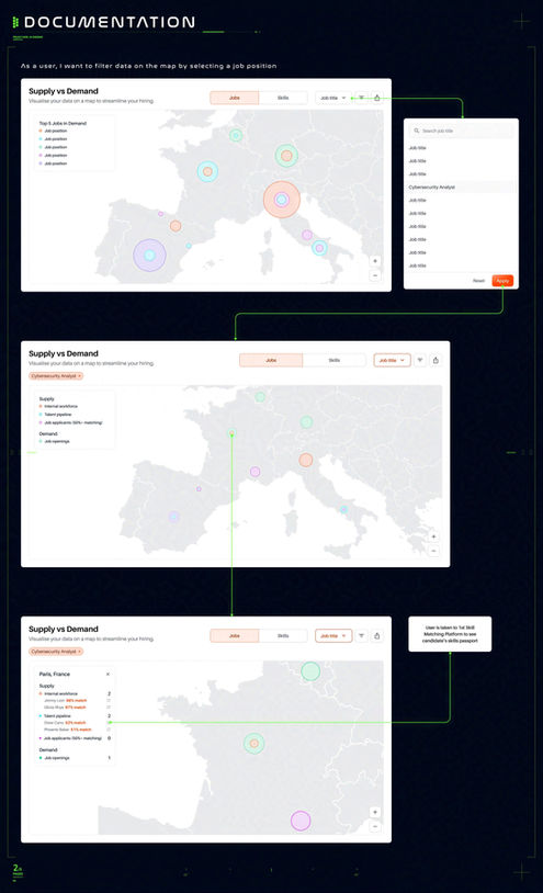
In the final stages of the Ideation & Design phase for the Abodoo Skills Mapping project, I curated a handover document of high-fidelity screens detailing dashboard functionality. Arrows guide developers through scenarios, breaking down interactions step by step. This documentation ensures precise implementation, and developers appreciated the thorough UX/UI guidance.
TESTING & LAUNCH
The graphs collectively transform the dashboard into a vital tool for recruiters, government officials, and educators to monitor skills and job demands dynamically. As this was a brand-new platform built on the fly, we lacked traditional metrics, so positive feedback from potential clients served as our success gauge, validating our approach. Regrettably, no formal user testing occurred post-development due to budget constraints.
Continual enhancements via user testing mark the next phase, potentially adding new charts or refinements to the library. The project's success underscores the value of teamwork, rigorous research, and an iterative design-improve cycle. While our method yielded strong results, a deeper initial research phase and sharper user goals could have boosted impact further. Moving forward, we'll allocate more time for testing to enable even more refined solutions. The test launch, fueled by enthusiastic user feedback, signals strong progress toward our ambitious vision.
CONCLUSIONS
The skills mapping feature stemmed from the CEO spotting a market gap, leading to a swift build of a new platform within the Abodoo Skills Suite. Our design effectively resolved key challenges, resulting in a dashboard notable for its innovative concept and streamlined yet potent user experience. Recognizing room for growth, we see potential in expanding the graph collection—perhaps by segmenting them across pages or enabling user-customizable views.
Reflecting on the success, it stands as proof of addressing genuine user needs through deliberate design. It also emphasized the importance of an exhaustive early feature review, highlighting the benefits of incorporating all viable enhancements upfront. This lesson will guide future projects, promoting comprehensive innovation from the start.


