DELIVERABLES
Research
User Flows
UI Visuals
Prototype
DSM Library
ROLE
Senior UX Designer
YEAR
2025
PROGRAMS
PROJECT OVERVIEW
PROBLEM STATEMENT
The initial onboarding experience on the abodoo platform was overly simplistic and lacked depth. New users provided basic details like name, email, and phone during signup, but then had to navigate separately to the Skills Passport page to complete a lengthy 14-step process. The project's challenge was to redesign the post-signup onboarding to streamline this process, integrating AI-powered options for easier completion while ensuring users built a comprehensive, portable digital credentials profile for better skills matching and career opportunities.
ROLES & RESPONSIBILITIES
As the lead designer on the onboarding project, my role was integral to defining and solving key user experience challenges. In addition to creating high-fidelity prototypes and detailed design documents for the development team, I was responsible for presenting these solutions to the CEO. Collaborating closely with the Project Manager, I ensured our design strategies aligned with business objectives, while my occasional direct interactions with developers helped navigate the intricate balance between design and technical limitations.
DURATION & HANDOFF
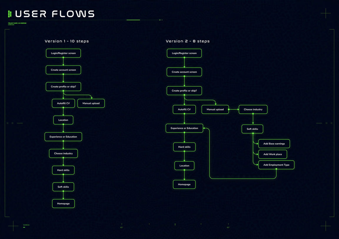
The project spanned 4 weeks, starting with a high-paced design week workshop. The entirety of the project was designed in Figma, including the hand over documents for developers. I updated the entire company through Slack of its completion and updated the Atlassian document. The handover documentation includes pixel perfect screens and user flows. This mix of user flows with high fidelity screens helped developers understand how to handle every possible scenario.
SCOPE & CONSTRAINTS
In this project, my focus extended beyond simplifying the onboarding flow; it involved guiding users through the Skills Passport creation with a better user experience. This feature was more than a series of forms, offering AI-assisted filling, progress indicators, and personalized recommendations, all while considering the user experience. A notable design constraint was balancing data collection for accurate skills matching without overwhelming users, especially first users.
RESEARCH
Under the constraints of a tight timeline, our project faced the challenge of conducting in-depth market research within a limited period. While this scenario restricted our ability to delve deeply into the onboarding processes of direct competitors, it opened avenues for a more creative approach more suitable to our platform. I focused on analysing a broader range of digital platforms where skills profiling and onboarding played a critical role. This included exploring various job matching sites, professional networks, and applications that necessitate the upload of resumes or LinkedIn data for profile building. These platforms provided a rich comparative landscape to understand diverse onboarding strategies and their implications on our user experience.
After analysing the competition, I used websites such as Behance and Dribbble for creative inspiration and gathered them in an art board in Figma with the most valuable ideas and inspiration. This art board collection was important to brainstorm several concepts, later polished out and transformed into actionable design strategies to push the project forward. A lot of the ideas from this art board ended in the last iteration of the designs.
UNDERSTAND
At the outset of the project, the issues we faced appeared straightforward, yet the complexity of finding the right balance of how much steps to include soon became apparent. We lacked analytical data from our users to base some of these decisions on, making it a unique challenge to solve. To navigate this uncharted terrain, I relied on insights gained from my experience with similar platforms, blending this knowledge with innovative design and development strategies.
Collaboration with the project manager was key in tackling these challenges. Through daily stand-up meetings, we continuously evaluated our progress and adapted to new limitations. These sessions were critical for getting the steps correct for the best onboarding experience. Over time, we observed an expanding project scope and had to make some sacrifices for the MVP launch.
Our primary objective evolved into crafting a user experience that was not only intuitive and guiding for the users but also allowed the user to experience the value of the platform. This last part was crucial in creating a flexible and robust onboarding system, to get users to experience the benefits of the platform quicker than ever before.
1. What’s the problem you are trying to solve?
The problem we aimed to solve was enhancing the onboarding experience for a quicker and successful completion of the Skills Passport completion, which lacked efficiency and integration.
2. Who are the users and what are their goals?
The users are jobseekers and students, with goals of building their profile facilitated through a streamlined, intuitive onboarding process.
3. How will they benefit from this feature?
Users will benefit from a more intuitive onboarding process, leading to improved profile completion, reduced drop-offs, and get more users to use the platform.
4. What will the target persona be doing when they encounter this feature?
Upon encountering this feature, the user, will have more options to fill out the Skills Passport with AI assisted autofill feature and a better manual step by step guide.
5. What threshold of quality do we need in order for customers to experience core product benefits?
The quality threshold required is a user-friendly, intuitive interface with reliable functionality, ensuring a seamless onboarding process that enhances user satisfaction and trust in the platform.
6. What assumptions are we making?
We are assuming that users would prefer to see the value of the platform first before filling out till completion the Skills Passport. But the platform can’t work properly if it doesn’t have the users skills uploaded.
01.
What's the problem you're trying to solve?
Share your feature information here to attract new clients. Provide a brief summary to help visitors understand the context and background.
02.
Feature title
Share your feature information here to attract new clients. Provide a brief summary to help visitors understand the context and background.
03.
Feature title
Share your feature information here to attract new clients. Provide a brief summary to help visitors understand the context and background.
04.
Feature title
Share your feature information here to attract new clients. Provide a brief summary to help visitors understand the context and background.
05.
Feature title
Share your feature information here to attract new clients. Provide a brief summary to help visitors understand the context and background.
06.
Feature title
Share your feature information here to attract new clients. Provide a brief summary to help visitors understand the context and background.
COMPETITOR ANALYSIS
Due to do time constraints and limited insights from direct competitors, I adapted my research approach to include platforms with similar onboarding flows. Exploring professional networks like LinkedIn, job sites like Indeed, and skills platforms, I gathered valuable insights from their profile-building methods. While these systems had different user narratives, their UI designs offered diverse approaches to user interaction, crucial for our objectives. This broader perspective was instrumental in crafting an onboarding process for abodoo that was both user-friendly and sophisticated.
PAINPOINTS
In tackling the Onboarding project, I faced the challenge of limited research time coupled with little information about our competitors' processes. To effectively navigate this part of the design phase, I pivoted my research towards diverse platforms with similar goals, such as professional networks and job matching apps. These platforms, while not direct competitors, provided valuable insights into friendly user interface designs.
Although these platforms catered to different user stories, their UI/UX designs offered versatile approaches beneficial to our context. This strategic shift in research was crucial in developing an onboarding process tailored to abodoo's needs. It allowed me to identify essential features and create a few conceptual designs, enhancing the user experience for our diverse users and preparing the system for potential future expansions.
EFFORT VS IMPACT
An Effort vs Impact chart was developed to prioritize features and enhancements. A lot features from the list was descoped for future iterations. This streamlined approach allowed us to efficiently convert these critical features into user stories, facilitating a rapid transition from concept into creating high-fidelity mockups. We prioritised features that causes the most friction or frustration in users such as the amount of steps for completion, integrating LinkedIn autofill and AI assisted autofill.
ROADMAP
We focused on deploying an MVP that promptly met user's fundamental needs. This phase was crucial for early implementation and gathering user feedback. As we progressed, our strategy included not only enhancing the user interface, such as potentially introducing a progress tracker for a more comprehensive overview. This consideration was pivotal in allowing the system to adapt and evolve, accommodating any future functionalities without compromising performance or user experience.
IDEATION & DESIGN
During the ideation phase of our project, I explored many different styles of the welcome page which informed the user the reasons why they need to fill out the Skills Passport. The AI assisted autofill or the LinkedIn log in integration, needed only the first page and the final page which would be the summary page of the user Skills Passport filled out. The manual path to fill out the Skills Passport in the extreme case where the user has no CV or LinkedIn profile, was the most challenging. These wireframe mockups were shared across the company and I gathered feedback.
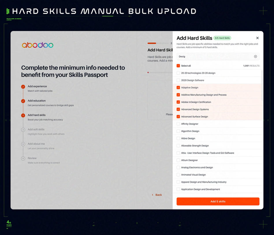
After multiple iterations and team member feedback, we finalised a flow. We also decided to bring one of the features from the roadmap that was initially set for second phase of iterations. Introducing a side panel for the user to be able to quickly select and deselect hard and soft skills was a key component in further improving the onboarding process. I further tested out the functionality of this side panel, ensuring it would help the user and not create more friction.
Finally, I validated these user flows with the Project Manager and CEO, advancing to the development of detailed high-fidelity prototypes. I set out to create the three high fidelity prototypes to test what was the best combination of steps or questions needed to benefit the most from the platform. These prototypes were shared on Slack and feedback was gathered quickly. This phase was critical in ensuring that our designs met user expectations and set the stage for a user-focused final product development.
HOW MIGHT WE
"How Might We" statements were crafted to stimulate creative thinking and problem-solving.
How might we effectively communicate the status of each onboarding step (like minimum of 5 core skills and 10 hard skills) to enhance user clarity and reduce confusion in the flow?
How might we design the onboarding process to provide the most amount of benefit with the least amount of questions to fill in?
How might we design the onboarding process to be intuitive and user-friendly?
How might we ensure that users are aware of the reasons we need the Skills Passport to be filled out before arriving to the platform?
How might we integrate supportive features, like help tips or FAQs, within the onboarding UI for immediate user assistance?
How might we be able to hand hold more the user through his process?
USER STORIES
I developed user stories closely aligned with our users' experiences. These stories guided our design, ensuring that each feature addressed real user needs and real statuses of the Skills Passport requirements. This approach helped us empathise with our users, leading to an onboarding process that was intuitive, user-centric, and highly effective in meeting their specific requirements.
User story 1
As a new user, I want to sign up quickly and easily, so that I can start benefiting from the platform's features without unnecessary delays.
User story 2
As a new user, I want to connect my LinkedIn account during onboarding, so that my profile data can be automatically imported to streamline Skills Passport completion.
User story 3
As a student or jobseeker, I want to upload my CV for AI-assisted filling, so that the platform can extract and populate my skills efficiently without manual entry.
User story 4
As a user without LinkedIn or CV, I want a guided manual step-by-step process, so that I can complete my Skills Passport intuitively and without frustration.
HI-FI DESIGNS
In the pursuit of an effective MVP for the abodoo project, the designs were simple yet effective in conveying the reasons behind filling in the Skills Passport and more options for the user to undertake this action. The initial MVP featured a streamlined LinkedIn and AI assisted autofilling and manual onboarding process. From there, we introduced a side panel to bulk add users skills. If the user went through the manual onboarding, the designs included a progress bar to see how many steps are left and a checklist to easily go back and forth if needed.
The journey from concept to high-fidelity design was meticulous, with each prototype iteration in Figma bringing us closer to a user-centric solution. These prototypes served as a way to quickly test for failures and potential enhancements. I honed the design elements, ensuring they effectively addressed user challenges and aligned with our overarching goals. This process of refinement was crucial in simplifying the user journey and maximizing the utility of allocated resources.
For each stage of the process I created an art board to focus on that specific stage of the process. The Project manager can leave her comments so a good portion of the questions I have are written there. The prototypes were created on their own separate art board and labeled to easily share with in the company. This way team members who never used Figma can find the prototypes without having to search in a huge page filled with random screens.
In the final stages of the Ideation & Design phase for the abodoo Onboarding project, I would create final handover documentation for the developers. These were a collection of selected screens that represent each scenario that a user can run into. This documentation was again built in its own art board for easier sharing and less confusion amongst developers, as I can mark it as “ready for dev”.
This documentation showcased each flow a user can and the possible scenario. This documentation has to answer every question a developer has. Each documentation a testament to meticulous design thinking and a user-first approach. The layout, intended for my portfolio, demonstrates the clean, intuitive interface we've achieved, highlighting the progress bar, checklist, and other key features that will streamline the user's journey.
TESTING & LAUNCH
The refined onboarding flow, integral to the Skills Passport journey, was crafted to effortlessly guide users, with transparent indicators of their progress and current status. Although at the time of writing these words, the new onboarding was implemented but no further tests were conducted. A few potential clients were shown the new improvements with very positive feedback as it met their expectations. This positive feedback affirmed the effectiveness of my solution.
Continual enhancement based on user tests is the next chapter of this project. The project's success has reinforced the importance of detailed user flow mapping and the iterative design process. While the design benefited from our approach, we acknowledged that more user testing is required. The forward-looking strategy includes a more generous allocation of time for research, laying the groundwork for even more impactful design solutions.
CONCLUSIONS
The onboarding feature was meticulously crafted to clarify and facilitate the complex Skills Passport onboarding process for students or job seekers. Our design solution effectively addressed all the identified issues, culminating in a flow that stands out for its aesthetic appeal and its substantial enhancement of the user experience.
Reflecting on the project's success, we recognise it as a testament to solving real user challenges through thoughtful design. It also highlighted the necessity of user testing real users even though we couldn’t due to budget. This insight will be invaluable for future projects, ensuring a thorough consideration of all innovative features from the outset.


